Design for your users!
Tag: web design
Digital Design: Creative Commons License Image

The most common way to get free images online is by searching website that use the creative common license. This license has different terms of author protection and credit given. There are specifications for example, some images may be used commercially and some are only for personal use. So lets say you have a business website and you are designing a logo, you may under no terms use a creative commons image that isn’t licensed for commercial use. So make sure you read all terms before use.
Meta Tagging and Good Content

If you skip the meta tagging at least write good content!
The best content may end with a negligible audience and therefore get very few incoming links. Very often, it will give a boost. We must find a way to get links from sites visited which will carry targeted traffic. From there, our content more likely to be linked back and shared by the readers of those sites.
Need something responsive?
http://www.lv-mtja-24.com/lasvegaswebdesign/developing-something-responsive/
Web Design Function to Add

Drafting of content emphasizing vocabulary devoted to customers and their expectations
Ensure consistency on the case ( uppercase & lowercase ).
Install the leading navigation area with a strategic point, preferably right close to the main content on the page.
Describe those things to be executed clearly and ideally employ the critical.
Differentiate the links to produce them easily recognizable and assign some other color to this non-visited links along with visited.
Group similar direction-finding controls and make use of navigation icons provided that they are clear.
Giving users direct access to the main functions on the site.
Design History of the Google Logo
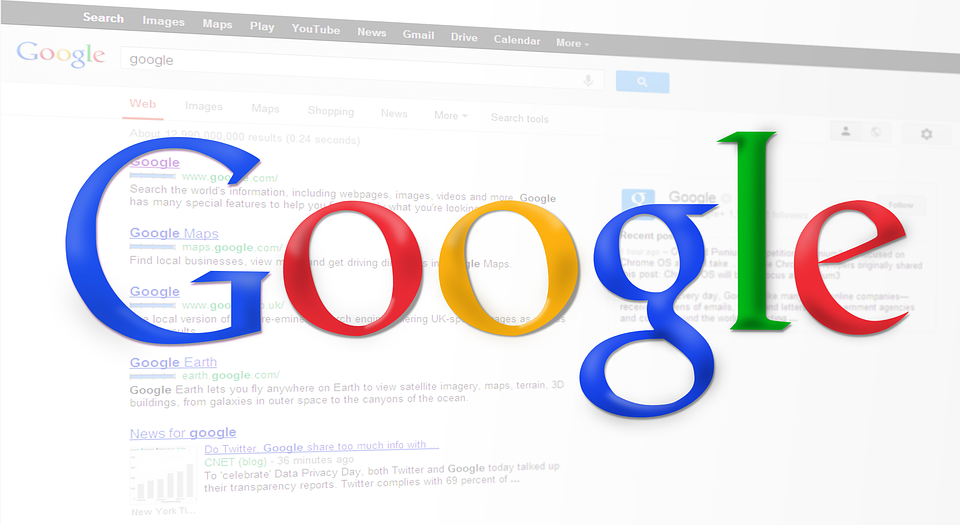
Google Inc Founded September 4, 1998 by Larry Page and Sergey Brin
The Logo: The Name. G in blue, O in red, O in yellow,G in blue, L in green, E in red.
The Google logo is very simple, it comes from its search engine. . The mathematical term “googol” in French “retard” is behind the word Google.
From the very start the Google logos have not undergone big changes, they share the same word and the colors: blue, red, yellow and green. Each letter in color as mentioned above. The first version of the logo was designed by one of the two founders, Sergey Brin on GIMP. This is also why the company did not have to pay its logo. GIMP is a popular ( old fashion ) photo editor similar to photoshop, but a bit slower.
